Overview
Fullscript is a comprehensive platform that enables healthcare practitioners to prescribe and deliver supplements directly to patients, streamlining personalized care. By integrating Fullscript into their practice, practitioners can save time, generate additional revenue, and enhance the efficiency of delivering tailored, effective treatments.
The Problem
Practitioners faced significant challenges using the existing favorites feature due to the following issues:
- Poor Discoverability: The favorites button was hard to find, leading to frustration and reduced usage.
- Cumbersome Process: Adding a product to favorites required multiple steps, making the experience inefficient.
- Privacy Concerns: Practitioners' favorites were always visible to patients, even when the intention was to keep them private.
- Disjointed Workflows: Key tasks, such as adding and managing favorites, felt disconnected from the primary prescribing workflow.
- High Friction Points: Simple actions, like categorizing or editing favorites, involved unnecessary effort, increasing the cognitive load.
These pain points underscored the need for a comprehensive redesign to make the feature intuitive, efficient, and aligned with practitioner workflows.
Here is a quick visual of the old state

Effects of the problem
- Wasted practitioners time during the plan writing process
- Caused trust issues as practitioners weren't confident in the feature
- Delayed revenue as it tool longer for practitioners to send prescriptions
Objectives
- Redesign the favorites experience to make it more intuitive and functional.
- Reduce the time to add to favorites by 40%.
- Reduce the time to add to cart from favorites by 40% - 50%.
- Increase the use of the favorites functionality by 20%.
Users & Audience
- 100,000+ healthcare practitioners across the U.S. and Canada.
Scope
- Preserve existing functionality: Ensure the redesign does not harm the current user experience.
- Platforms: Web and mobile web only.
Process
How might we reduce the time it takes for practitioners to save, access and prescribe products they want favorite?
After thoroughly understanding the problem, I applied the "How Might We" framework. This approach helped reframe challenges into opportunities, enabling the team to transition into solution-oriented thinking. It served as a catalyst for focused ideation and productive brainstorming.
Inspiration board
I then curated examples of products utilizing favoriting functionality. This research provided insights into existing patterns, highlighting opportunities to adapt, improve, and innovate based on what’s already out there.

Userflow
Next, I created a user flow for the core workflow—adding and removing items from favorites. This visualization helped identify potential friction points and opportunities for optimization. At this stage, I collaborated with engineers to review the flow, ensuring we surfaced any potential technical challenges early in the process.
.png)
Wireframes
With the user flow complete, I moved on to creating quick wireframes to explore potential solutions. This approach allowed me to test concepts early and engage leadership in a concept review. By involving stakeholders at this stage, we made critical decisions upfront, reducing the need for backtracking later in the design process.

Design exploration for critical UI/UX elements
Where favorites display on the catalog
This was a pivotal solution, as our goal was to streamline the process for practitioners to add favorited products to a treatment plan, reducing friction and time. To achieve this, we focused on surfacing favorited products or categories directly within the catalog. We ultimately chose option 4, which displayed categories alongside the number of products they contained. This approach struck a thoughtful balance—preserving page real estate to prevent other sections from being pushed below the fold while still delivering enough context to make the feature intuitive and efficient.

Modal Exploration
The modal was a crucial component of the workflow, designed to enable practitioners to efficiently manage their favorites by adding products to existing categories, creating new ones, and editing or deleting categories. I explored four design options, including an overflowing dropdown menu from the product card. Option 3 emerged as the most effective solution, as it eliminated the need for a search bar, reducing engineering complexity. Additionally, it leveraged intuitive icons to streamline interactions, reducing information density and enhancing clarity for users.

Making categories visible to patients
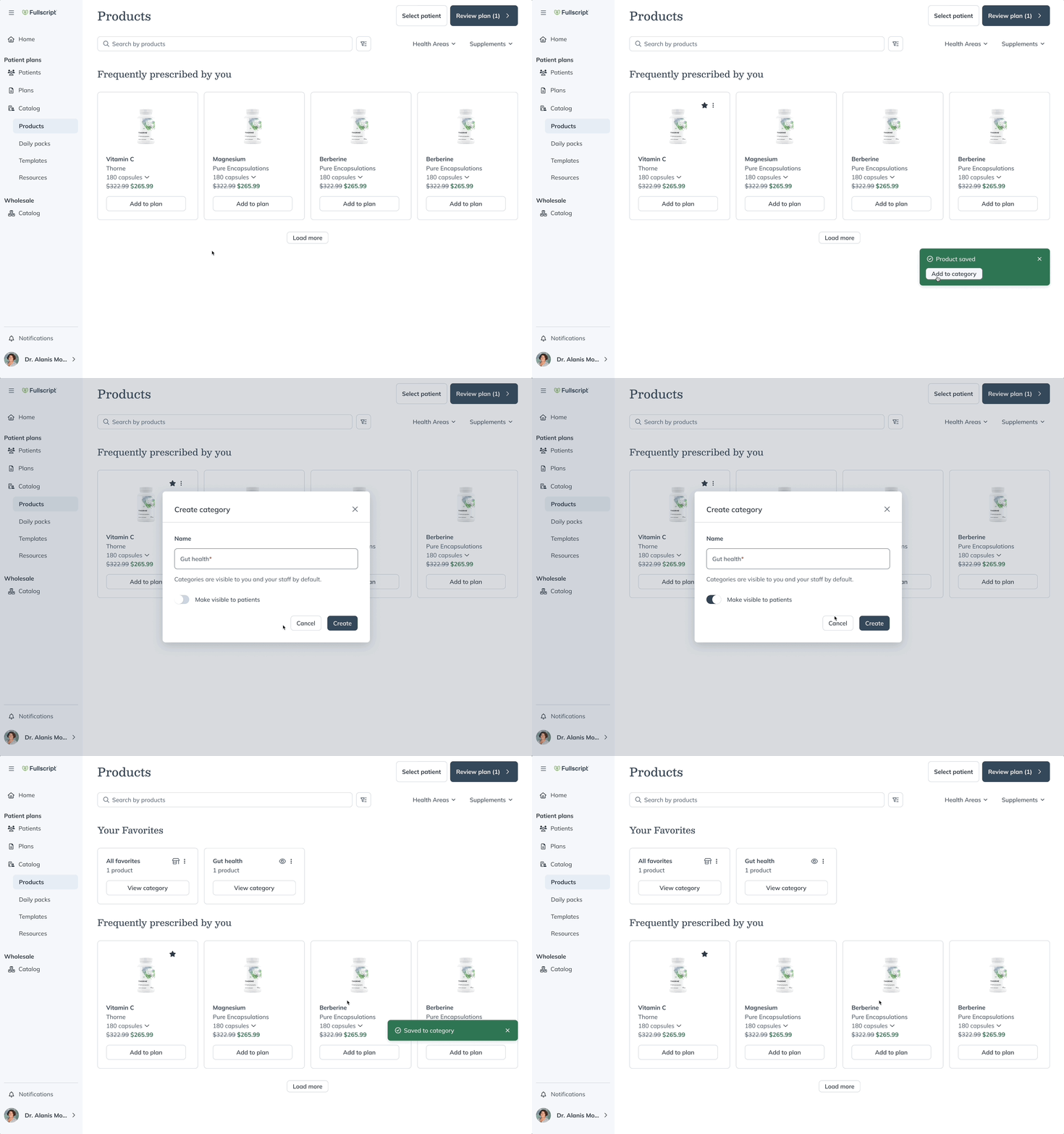
During the category creation process, practitioners can decide whether a saved category should be visible to their patients. Visible categories would appear in the patient app as part of their catalog page. While option 1 was functional, it required an additional click to change a category’s visibility. Option 2, which used a toggle UI element, was preferred because it streamlined the interaction. Given that this was a straightforward binary decision, the toggle proved to be the most efficient and user-friendly pattern for this use case.

Bring It all Together: Redesigned Favorites Experience - Main Workflows
Below is the complete prototype showcasing the revised feature, incorporating updated UI elements and optimized workflows. This iteration reflects the refinements made throughout the design process, focusing on improved usability and efficiency for practitioners.
1. Adding to & removing from Favorites
Users can now seamlessly add products to their favorites, as the favorites button is no longer buried within a menu. Additionally, they can favorite products and create new categories without interrupting their current workflow, ensuring a smoother and more efficient user experience.

2. Viewing/accessing Favorites from the catalog page and explore page
Users can now seamlessly view their saved products within the primary workflow of prescribing products for patients. These are displayed as interactive categories, making engagement intuitive. Additionally, saved product categories are integrated into the filters panel, enabling users to quickly locate and access them with ease.

3. Adding a saved product to multiple categories
The redesigned flow streamlines the process, allowing users to effortlessly add a saved product to multiple categories without disrupting their primary workflow. This enhancement minimizes context switching, keeping the experience seamless and efficient.

4. Editing Favorites from the category display page
The design also enables users to edit categories—renaming, changing visibility, or deleting them—directly within their primary workflow. This ensures that category management is seamless and non-disruptive, maintaining user focus and efficiency.

5. Removing products from Favorites
Users now have the ability to remove products from individual categories or from all categories with a single click, streamlining category management and reducing the effort required for cleanup or reorganization.

The redesigned experience has significantly improved the favoriting functionality, making it more intuitive and efficient. This project exceeded all business objectives:
- Reduced time to add to favorites by 60%, surpassing the target of 20%.
- Reduced time to add to cart from favorites by 75%, exceeding the target of 25%.
- Increased use of the favorites functionality by 50%, surpassing the target of 20%.
Mobile Web Version
This redesigned experience wasn’t limited to desktop—it was fully optimized for mobile, prioritizing a mobile-first approach. By ensuring responsiveness and intuitive usability on smaller screens, the design delivers a seamless experience across devices, meeting users where they are.

Engineering handoff
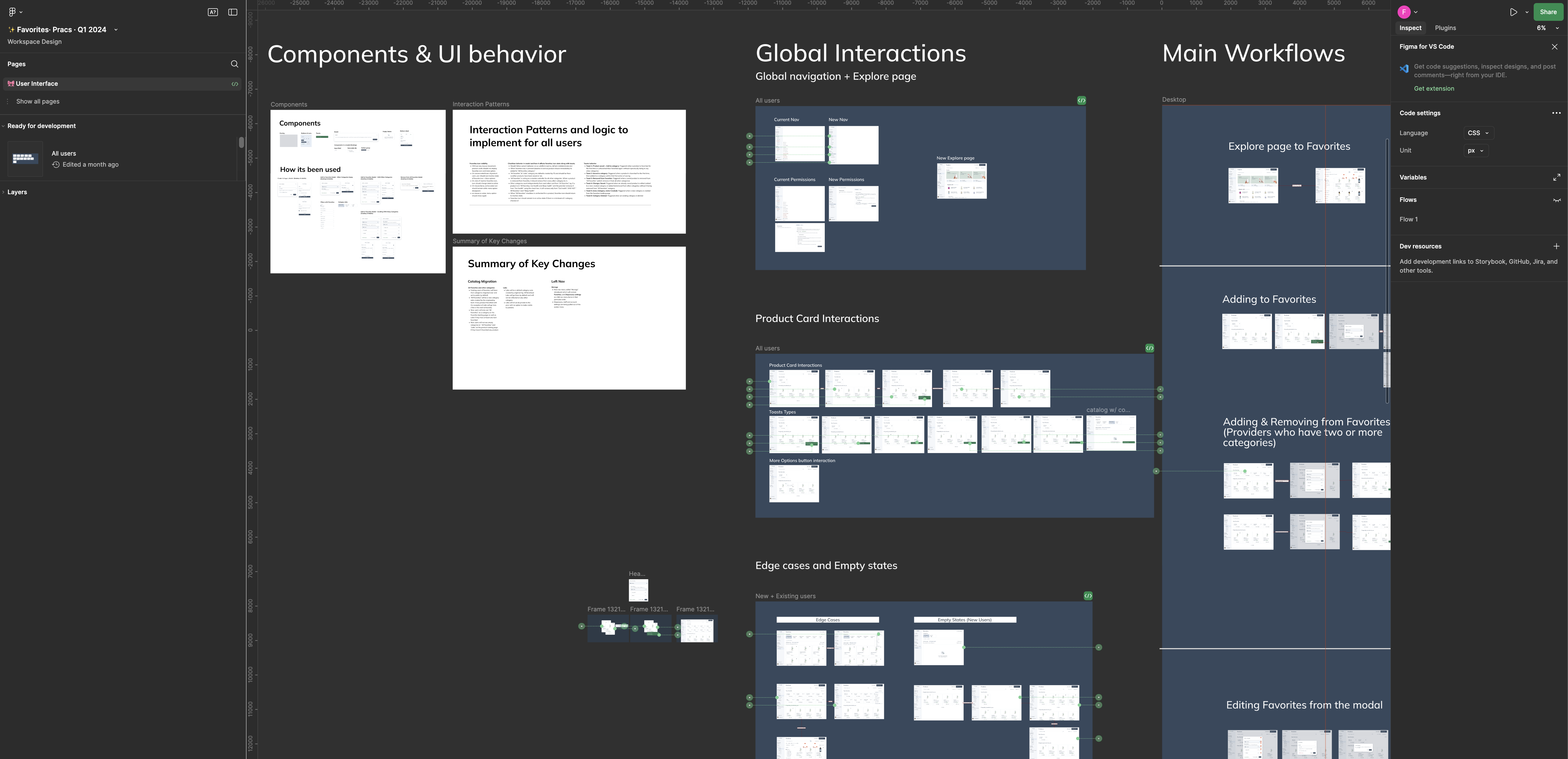
I finalized the handoff to engineers by delivering the complete set of screens in Figma. To ensure clarity and alignment, I included detailed annotations, links to Loom videos, and supporting documentation. This thorough handoff process minimized ambiguity, streamlined implementation, and fostered a collaborative approach to development.

Challenges
The biggest challenge in this project was tailoring a commonly used feature like favorites to fit the unique complexity of Fullscript, a platform catering to B2B, wholesale buying, and B2C use cases. To simplify the experience and ensure relevance, we strategically focused this redesign exclusively on the "B2B" side of the platform, allowing us to deliver a more targeted and effective solution without compromising on usability.
One critical potential problem I needed to address was the possibility of users missing the toast notification when favoriting an item. Missing this feedback could have disrupted the user experience. To validate the effectiveness of the toast, I conducted user testing, which revealed that 100% of users noticed the toast for the following reasons:
- It was animated, which naturally drew attention, even within the user’s peripheral vision.
- It remained visible for 10-12 seconds, providing ample time for users to see and process the notification.
This combination of animation and timing ensured the toast was an effective and reliable feedback mechanism.
Lessons
My biggest takeaway from this project was to never assume a project will be simple or straightforward. Most initiatives carry underlying complexities that can significantly impact the timeline for design, development, and launch. Always plan with room to address the unexpected, as this foresight is crucial for managing challenges effectively and delivering successful outcomes.
View next project: iOS Filter Upgrade
